Homepage Guide
If you use the One-Click Theme Setup, then the demo homepage will automatically be created for you using Gutenberg editor blocks. You can learn more about Genesis Blocks by going to the plugin page.
To edit the Homepage, go to Pages > Home.
Everything we set with Container and Columns using Genesis Blocks
Custom CSS Classes
Some blocks have limitations or settings which are not yet available to configure so added Custom CSS Classes for some Blocks.
#1. Latest Posts Section:

- Add columns
- Select 1 Column with 100% width – Align Center and Inner Width 1200px

- Columns: Align Full Width
- Columns: Background Color: #fcefeb
- Select 1 Column with 100% width – Align Center and Inner Width 1200px
- Inside Column
- Add Spacer with Height 30px
- Add Heading H2 “Latest Blog Posts”
- Add Paragraph with content of your choice with “margin0” Additional Css Class(es)
- Add Post and Page Grid Block with Settings as below
- Style: Default
- Number of Items: 8
- Columns: 4
- Display Featured Image: Enabled
- Image Size: Featured Image Square (292×292)
- Display Title: Enabled
- Slider: Enabled with Columns 4
(NOTE: when slider enabled columns specified here only taken into account)

#2. Top Cateogories Section

- Add columns
- Select 1 Column with 100% width – Align Center and Inner Width 900px
- Columns: Align Full Width
- Columns: Background Color #d46e6c
- Inside Column
- Spacer with Height 20px
- Heading h6 “CHECK OUT OUR TOP CATEGORIES:”
- Add Columns with 5 Columns

- Each Column Contains Circle Image(Image Size: 140×140) with Caption
- Space with Height 10px

#3. Blog Posts Section

- Container with Margin Top: 3% and Max Width: 1200px
- H2 Heading “Our Most Read Blog Posts” with “Heading with Arrow” style.
- Add Columns with 2 Half Columns
- Left Column
- Post and Page Grid with “Style 2 with Titlte on Top” Style

- Post and Page Grid with “Style 2 with Titlte on Top” Style
- Right Column
- Post and Page Grid with “Default” Style and settings below

- Paragraph with “Link Section” style and add link

- Post and Page Grid with “Default” Style and settings below
- Add Search Block

#4. About Section
- Container without any setting changes
- Inside Container
- Advanced Columns – 2 Columns with 75/25 Size

- Left Column
- Add Columns with 2 Columns 50/50 Size
- Left Side
- add Client Image of size 600×600
- Right Side
- Heading with “Cursive” Style and Font Size: 120px

- 1 or 2 Paragraph that explain about client
- Social Icons Block with Below settings

- Heading with “Cursive” Style and Font Size: 120px
- Advanced Columns – 2 Columns with 75/25 Size
- Right Column
- Heading H6 “NEW? GET STARTED HERE.”
- Buttons with Vertical Variant and Settings as Below


- Spacer with Height 20px
#5. Featured In Section

- Container
- Width 900px
- Advanced Css Class(es) “logos”
- Columns 2
- Left:

- Heading H6 “Featured On”
- Align center
- Color #b4babd
- Left:
2. Right: 
1. Image Gallery with Logos you choose
2. Style “Light” style
3. Columns 6 or specify custom
4. Image Size Thumbnail
5. Advanced Css Class(es) “logosgallery”
#6 Categories Display with Tabs

- Container
- Margin Top 4% and Margin Bottom 1%
- Inside Container
- Heading H3 “An Excellet Tri-Category Display Section”

- Paragraph with Text of your choice
- Ad Tabs Block – Custom Block added by Anchored Design to Blogger Theme

- Add Tab and Remove Tabs as needed
- Tabs Settings: Please check above image for settings
- Tabs
- Title: Title of your tab
- Content: Content we added shortcode to show posts from specific category with display posts shortcode
[display-posts posts_per_page="4" wrapper="div" image_size="genesis-featured-image" class="one-fourth"]- About Display Posts Shortcode read here and to have four column layout we added class “one-fourth”
- Column Classes to use
2 Columns: “one-half”
3 Columns: “one-third”
4 Columns: “one-fourth”
6 Columns: “one-sixth” - Thumbnail image(image_size): Genesis featured Image 292px width X 292px height
- Link to category
NOTES:
1. Tab content not support other block styling so we can always create link outside of content and copy paste inside content
- Space wiht Height: 50px
- Heading H3 “An Excellet Tri-Category Display Section”
Below is Tabs Demo with Different Color

#7 Categories Section with Two Columns

- Container
- Advanced Columns with 2 50/50 Columns and Column Gap 1
- Each Column Settings

- Padding Top 15, Padding Right 15, Padding Bottom 25 and Padding Left 15
- Background Color #fcefeb
- Inside Each Column
- Heading H3, Align Center
- Paragraph Text
- Post and Page Grid Block with below Settigns

- Paragraph with “Link Section” style with Link inside and align center

#8 Latest Posts Section
This section will be same as Section #1 just without background color
#9 Optin Section
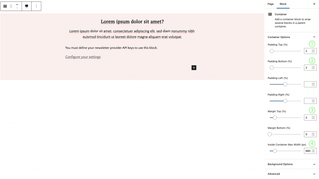
- Container
- Padding Top and Bottom 2%
- Margin Top 5%
- Container Width 680px
- Inside Container
- Heading H3 with align center
- Paragraph Text
- Email Newsletter Block from Genesis Block which only connect to mailchimp right now
- Configure settings <YOURSITEURL>/wp-admin/admin.php?page=genesis-blocks-settings at Admin > Genesis Blocks > Settings
- Enter your mailchimp api key

- Configure Block Settings as required
